SEYPEC 40th Anniversary Logo
A Story of Growth and Resilience
As the Seychelles Petroleum Company Limited (SEYPEC) marks its 40th anniversary, the company has unveiled a commemorative logo that aims to reflect the tale of the company's journey, tenacity, and dedication to the country. Each component of the design has been thoughtfully created to capture SEYPEC's history and future goals.
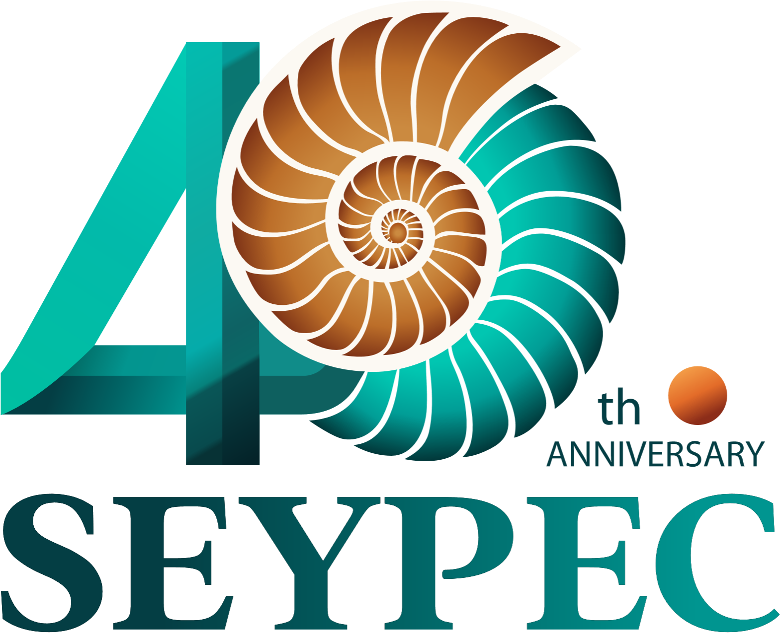
The Shell: A Sign of Advancement
The SEYPEC corporate logo's principal features are an energy dot reflecting the sun and a fossil shell signifying the origins of oil as the interaction between fossils and the sun. These twin components are also key feature of our tropical islands, providing the brand and its accompanying marketing strategy with a uniquely Seychellois personality.
The 40th Anniversary logo shows a Nautilus shell, a representation of ongoing development and progress, sits at the centre of the logo. This decision is appropriate for SEYPEC, a business that has contributed significantly to the economic and energy stability of Seychelles in addition to adapting to developments in the industry during the last forty years.
CEO Sarah Romain explains that SEYPEC has gradually changed from guaranteeing a local fuel supply to becoming a major player in the global oil trade, much like the Nautilus, which develops in precisely the right mathematical proportion. ‘The shell, which is seamlessly incorporated into the number "40," highlights the company's ongoing advancement while reiterating the significance of this anniversary. Deepness is added with a delicate gradient effect, which also gives the design a contemporary, dynamic vibe that embodies SEYPEC's progressive philosophy.’
A Strength and Energy-Based Design
Within the design, a tiny orange sphere stands for progress and energy, two essential components of SEYPEC's objective. This component quietly emphasizes how the business supports not only automobiles, businesses, and residences but also the advancement of the country via creativity, resiliency, and financial contributions.
Director of Corporate and Human Resources Unice Romain told NATION: ‘We have very carefully chosen the typography to balance strength and modernity." While the sleek sans-serif font for "40" provides a modern touch and denotes a forward-thinking attitude, the bold serif font for "SEYPEC" communicates professionalism and trust. The sophisticated,
minimalistic writing style of "Anniversary" guarantees a neat and tasteful composition that complements SEYPEC's corporate identity.’
Using Colours to Tell a Story
The colour scheme has a deeper meaning than merely being a beautiful choice:
• Teal Green: This shade, which stands for sustainability and dependability, represents SEYPEC's dedication to preserving a stable and secure energy source while embracing sustainable future ideas.
• Golden Brown: This colour, which stands for energy and petroleum, recognizes SEYPEC's roots in the oil sector and its vital role in the advancement of the country.
• Deep Green: This colour symbolizes stability and longevity, demonstrating the company's ability to withstand changes in the economy, geopolitical obstacles, and industrial landscapes.